Challenge
Addland had evolved from a land-finding and assessment service into a platform that brings together comprehensive property data in one clear, shareable report, allowing estate agents, architects and planning consultants quickly to research and share critical information with their clients.
But the name and brand were still rooted in the business’s past: the name “Addland” didn’t reflect the product’s depth, ease of use or ambition - and it wasn’t helping people understand what the platform really did.
Outcome
We renamed the business tytl, echoing the idea of a property “title”, to create a short, distinctive name that builds on what was already there while giving the brand room to grow.
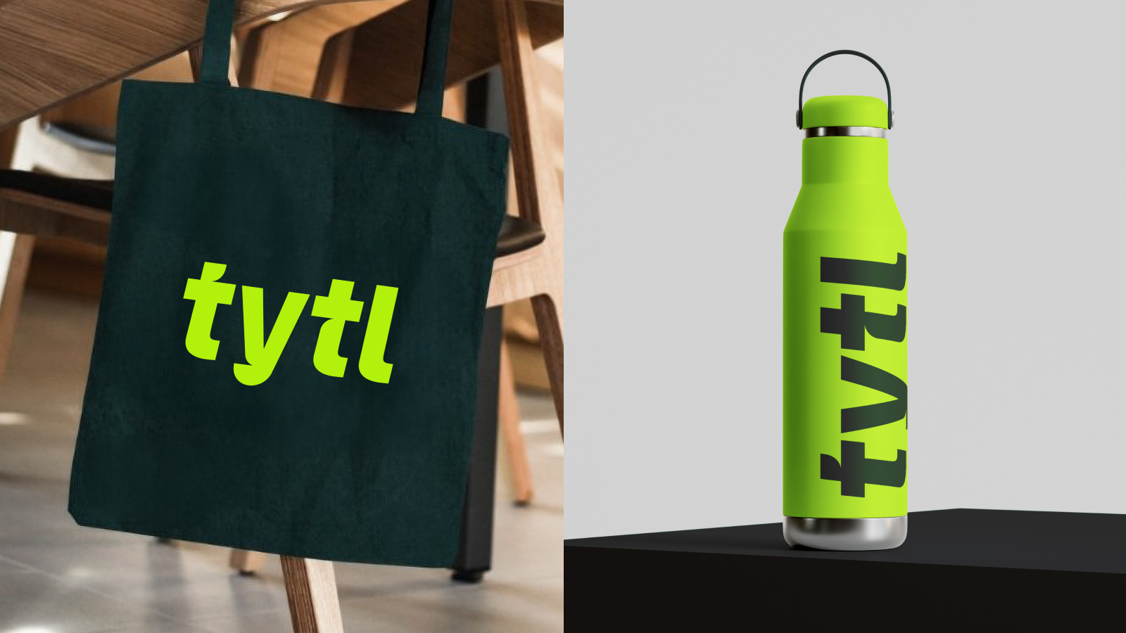
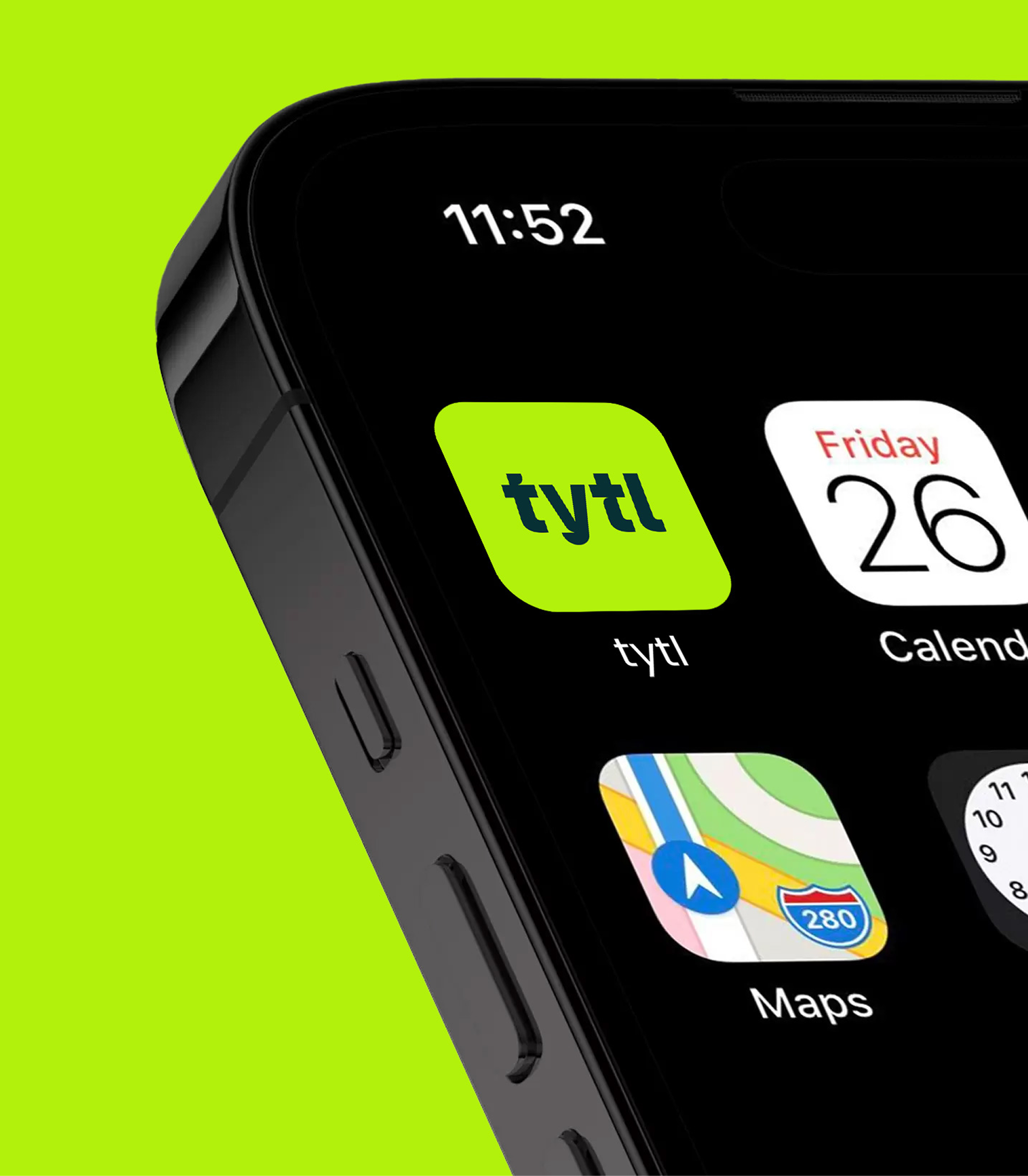
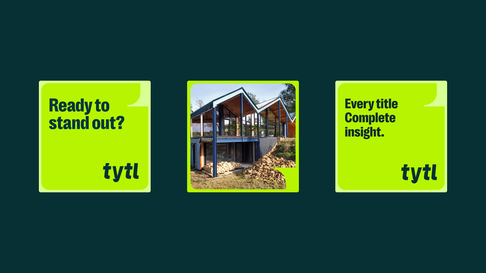
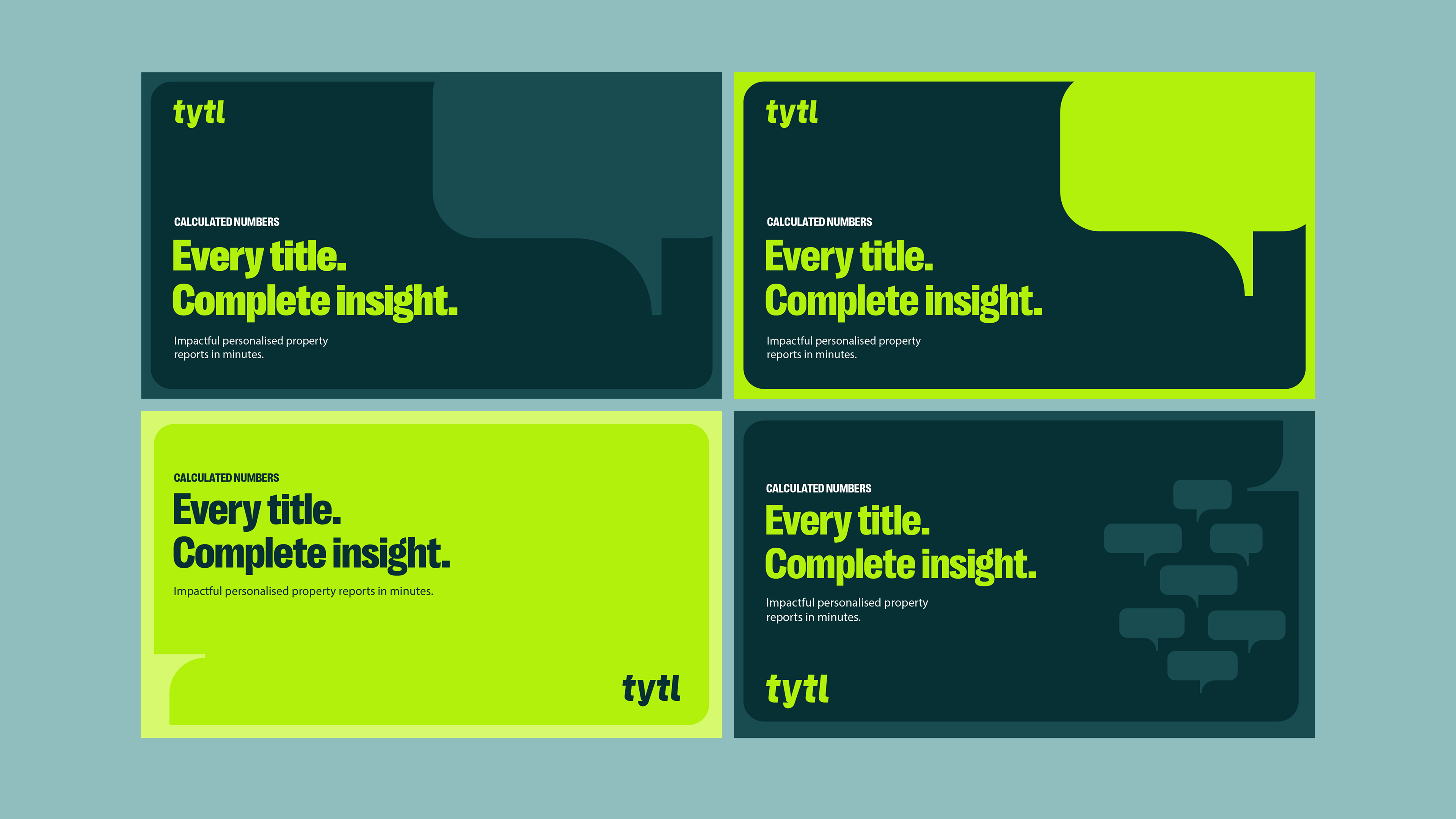
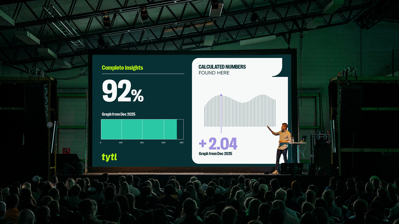
We then evolved the visual identity into a clearer, more confident system. Strong typography, a bold colour palette and simple layouts helped make complex data feel accessible, while also setting the brand apart in a market of largely functional, look-alike platforms.
The identity works across the product, website and communications, supporting a platform that gives agents instant property knowledge they can trust and share.
Results
tytl now has a name and brand that clearly reflect its offer and sets it apart. The rebrand helped reposition the business, improve understanding of the platform and support the next stage of growth.